
Develop and Test a UI component using React with Vitest


Table of contents
- What we are going to build
- Building the accordion component
- Testing with Vitest
- Installation
- Configure the testing environment
- How to run the tests
- Let's test!
- Structure of the testing code
- Test 1: Accordion should render with a title
- Test 2: Accordion should be closed by default
- Test 3: The accordion should open on clicking its title, "+" symbol or anywhere in between
- Test 4: Should be able to scroll if content exceeds a certain height
- Test 5: Accordion should have proper accessibility attributes
- Running all the tests
- Wrapping up
What we are going to build
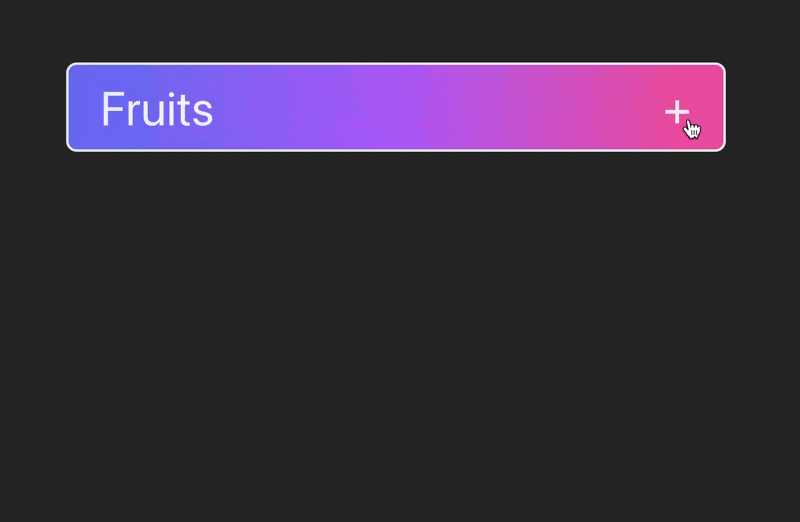
In this post, we are going to build an accordion with React and then test it with Vitest.
This is how it looks like ⬇️
Repos
You can access the code for this example here:
Functionality
We want our accordion to have the following functionality:
Its contents appear on clicking on its title or the plus "+" button.
When it is open, the "+" sign rotates into an "x" sign.
The contents can be anything, e.g. a list of items, a text paragraph, links, etc.
When the contents exceed a predefined maximum height, only a portion of them will be displayed, while the remaining content can be accessed using the scroll bar.
Required knowledge
To comfortably follow this tutorial, you should have some basic understanding of JavaScript and React, as well as familiarity with the concept of unit testing.
For quick reference, unit testing refers to the testing methodology that involves examining individual units (an accordion component in this case), to ensure they function correctly in isolation.
⚠️ Note about styling
Please note that although I am using Tailwind to quickly add styling, this is not the main focus here. The code I am showing provides only the functionality of the accordion, this is why the Tailwind classes are omitted in the code here.
Feel free to add your own styles or use the ones provided in this example, by checking the repository link I have provided above.
To install Tailwind, I followed this guide (using PostCSS): https://tailwindcss.com/docs/installation/using-postcss
Building the accordion component
Create a React project with Vite
In this example, I am using Vite to bootstrap a new React project. Vite offers a selection of frameworks and creates only the necessary files you need to get started.
Run the following command and choose React from the available prompts:
If you are using npm:
npm create vite@latest
Or, if you are using yarn:
yarn create vite
(For more info: vitejs.dev/guide)
For this project, I chose React with Typescript.
The accordion component
Let's create a components folder under src. Inside we will create an Accordion.tsx file where we will write the code for our component.

In the Accordion.tsx, we add a React component with the name Accordion, which is also going to be the default export. The accordion needs two props to function: a title of type string and children of type ReactNode. Next to the title we add the "+" symbol, which is the button that expands the accordion.
This is the code ⬇️
import { ReactNode } from "react"

type AccordionProps = {
  title: string
  children: ReactNode
}

const Accordion = ({ title, children }: AccordionProps) => {
  return (
    <div>
      <button>
        <h3>{title}</h3>
        <p>+</p>
      </button>
      <div>{children}</div>
    </div>
  )
}

export default Accordion
Managing the state
With this code we have all the visual "ingredients" we need for an accordion, but no functionality yet. We need our component to open/close when we click either on the "+" button or the title.
To achieve that, we have to find a way to manage the state of the accordion by first storing it somewhere. For this purpose, we are going to use the React hook useState to manage the state of a boolean variable called isOpen. This will initially be false since the accordion is closed by default.
Our code should look like this ⬇️
import { ReactNode, useState } from "react"

type AccordionProps = {
  title: string
  children: ReactNode
}

const Accordion = ({ title, children }: AccordionProps) => {
  // define state - default is false (closed accordion)
  const [isOpen, setIsOpen] = useState(false)

  return (
    <div>
      <button>
        <h3>{title}</h3>
        <p>+</p>
      </button>
      <div>{children}</div>
    </div>
  )
}

export default Accordion
Updating the state when changes are triggered
The next step is to trigger changes in the accordion state. We should be able to open/close it by clicking either the title or the "+". This is why we have enclosed both in a button element. This will allow us to add the onClick attribute, which is an event handler in React that listens for click events.
We pass the function handleClick in the onClick attribute, which is responsible for toggling the current state: if the accordion is closed, clicking on it will open it and vice versa.
This is what the code looks like ⬇️
import { ReactNode, useState } from "react"

type AccordionProps = {
  title: string
  children: ReactNode
}

const Accordion = ({ title, children }: AccordionProps) => {
  const [isOpen, setIsOpen] = useState(false)

  // toggles the state value
  const handleClick = () => {
    isOpen ? setIsOpen(false) : setIsOpen(true)
  }

  return (
    <div>
      <!-- pass the `handleClick` to the `onClick` attribute -->
      <button onClick={handleClick}>
        <h3>{title}</h3>
        <p>+</p>
      </button>
      <div>{children}</div>
    </div>
  )
}

export default Accordion
Showing/hiding the content
We have effectively managed to toggle the state of the component, but we are still rendering the children in all cases. The last step is to show/hide them depending on the value of the isOpen variable.
We can do that with conditional rendering. This means that an element is displayed based on certain conditions of the state of the application. Our component becomes dynamic and responds to user interactions.
Here, we are going to use the ternary operator (condition ? expressionIfTrue : expressionIfFalse) to conditionally render the children if the accordion is open.
We achieve that with the line of code we have added under the button element ⬇️
import { ReactNode, useState } from "react"

type AccordionProps = {
  title: string
  children: ReactNode
}

const Accodion = ({ title, children }: AccordionProps) => {
  const [isOpen, setIsOpen] = useState(false)

  const handleClick = () => {
    isOpen ? setIsOpen(false) : setIsOpen(true)
  }

  return (
    <div>
      <button onClick={handleClick}>
        <h3>{title}</h3>
        <p>+</p>
      </button>
      <!-- conditionally render the children -->
      {isOpen ? <div>{children}</div> : null}
    </div>
  )
}

export default Accordion
Accessibility
To make our component more accessible with assistive technologies, we can add the aria-expanded, aria-controls, as well as role attributes to the button element.
The aria-expanded is going to hold whatever value the state is, whereas the aria-controls the id of the div that hosts the children node ⬇️
import { ReactNode, useState } from "react"

type AccordionProps = {
  title: string
  children: ReactNode
}

const Accordion = ({ title, children }: AccordionProps) => {
  const [isOpen, setIsOpen] = useState(false)

  const handleClick = () => {
    isOpen ? setIsOpen(false) : setIsOpen(true)
  }

  return (
    <div>
      <!-- aria attributes for the button -->
      <button
        role="button"
        aria-expanded={isOpen}
        aria-controls="accordion-content"
        onClick={handleClick}>
        <h3>{title}</h3>
        <p>+</p>
      </button>
      <!-- aria attributes for the contents -->
      {isOpen ? <div id="accordion-content" data-testid="children">{children}</div> : null}
    </div>
  )
}

export default Accordion
💡Notice how we also added the data-testid attribute for the children div, which we are going to use later during testing.
Congratulations 🎉 We now have a functional accordion component, which we can use in different parts of our application.
Testing with Vitest
I choose Vitest for unit testing as it is fast, efficient and provides a very good user experience. If you are familiar with Jest, the learning curve is very fast but opposite to Jest, setting up and configuring things is easier (I really like that I can avoid the Babel configuration hell 🥲)
In case you are already using Vite for a project, things become even simpler since they both share the same configuration file vite.config.ts. This increases the reliability of the tests, which are performed in the same environment as the code.
Installation
Depending on whether you are using npm or yarn for your project you can use one of the two following commands to install the packages (dev dependencies) we are going to need during testing:
npm install -D vitest @testing-library/jest-dom @testing-library/react jsdom
Or ...
yarn add -D vitest @testing-library/jest-dom @testing-library/react jsdom
Configure the testing environment
We need to set up a few things before jumping into writing our tests.
First, let's create a folder with the name test under src. Inside this, we add a file with the name setup.ts:

In this file just add the following line ⬇️
import "@testing-library/jest-dom";
This will ensure that we have access to methods like toBeInTheDocument later on, when we are going to check specific behaviours from our dropdown.
The vite.config.ts file
This is the file where we can add settings to configure Vite and Vitest. It should contain the following code:
/// <reference types="vitest" />
/// <reference types="vite/client" />

import react from "@vitejs/plugin-react";
import { defineConfig } from "vite";

// https://vitejs.dev/config/
export default defineConfig({
  plugins: [react()],
  test: {
    globals: true,
    environment: "jsdom",
    setupFiles: "./src/test/setup.ts",
    css: true,
  },
});
When you bootstrapped the React project, this file should contain everything you see above, except for the test object, which is added here.
This provides the necessary settings to test our code:
globals: Setting this to true ensures that we have global access to functions like describe, it, expect, etc. that we are going to use shortly in out tests. Without this setting, we have to import them in each test file separately, like so:import {describe, it} from ‘vitest’environment: Since we are testing a DOM component, we need to perform the tests in an environment that simulates the browser, so we set this tojsdom. The default is node.js.setupFiles: points to thesetup.tsfile we created earliercss: ensures that the CSS is being parsed correctly (e.g. when we need to check if an element has a hidden attribute). This setting can potentially slow down running your tests a bit.
How to run the tests
We can add this line in the script section of the package.json file ⬇️
"test": "vitest --reporter verbose --environment jsdom"
This enables us to run the tests via npm run test or yarn test later!
Let's test!
Now that our environment is set up, we are ready to write our first test. Let's add an Accordion.test.tsx file in the components folder, like so:
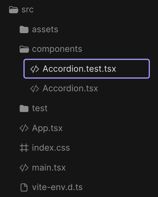
Notice how the test file has the same name as the component we want to test with the addition of the .test.tsx suffix.
In the newly created file, we need to import some functions from the @testing-library/react we installed earlier, as well as the Accordion component we want to test.
import { render, fireEvent, screen } from "@testing-library/react";

import Accordion from "./Accordion";
❗️Remember we have added the setting globals: true in our vite.config.ts file, so we don't have to import any vitest functions here. If we hadn't though, we should have added an extra line at the top of the previous code, importing them in:
import { describe, it, expect } from "vitest";
import { render, fireEvent, screen } from "@testing-library/react";

import Accordion from "./Accordion";
Structure of the testing code
First, we will use the describe function to group our tests together. This will create a test suite for all tests related to the accordion component. Inside describe, we are going to call many it functions (it is an alias for test - both can be used interchangeably), defining individual tests.
import { render, fireEvent, screen } from "@testing-library/react";

import Accordion from "./Accordion";

describe("Accordion component", () => {
  it("describes an individual test", () => {});
}
All subsequent tests are going to be it calls inside the suite determined by the describe function.
Test 1: Accordion should render with a title
In this test, we should first render the Accordion and then check if it has a title. The code for that looks like this ⬇️
import { render, fireEvent, screen } from "@testing-library/react";

import Accordion from "./Accordion";

describe("Accordion component", () => {
  it("renders with title", () => {
    // Given
    const title = "Fruits";
    const accordionElement = (
      <Accordion title={title}>
        <div></div>
      </Accordion>
    );

    // When
    render(accordionElement);

    // Then
    const accordionTitle = screen.getByText(new RegExp(title, "i"));
    expect(accordionTitle).toBeDefined();
  });
}
I use the Given-When-Then pattern to write structured and readable tests. Let's see what happens here in steps:
We store in variables the an
<Accordion />element as well as the title we want to pass into it.We then render the accordion in the testing environment. We use the
renderfunction provided by the@testing-library/react.We now want to access the element that holds the component's title. To do that we call the
screenfunction which gives us access to querying the virtual document body. We then attach the.getByText()method passing the title we created the accordion with as an argument.Lastly, we want to make sure that the title is defined, which means that is present in the DOM. The
expectis an assertion function that takes theaccordionTitlevalue to be tested as an argument. ThetoBeDefinedis the matcher that checks if the provided value is indeed defined.
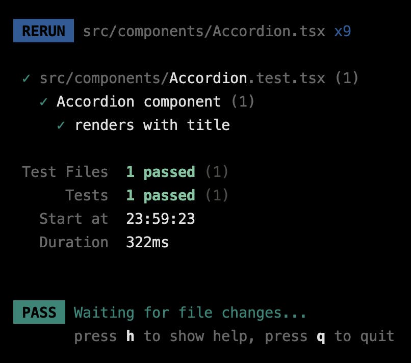
⚡️ We can run now our first test by typing the command npm run test or yarn test in our terminal and see it pass.
Let's try to change the last matcher to toBeUndefined and then run the test again. This is the result now ⬇️
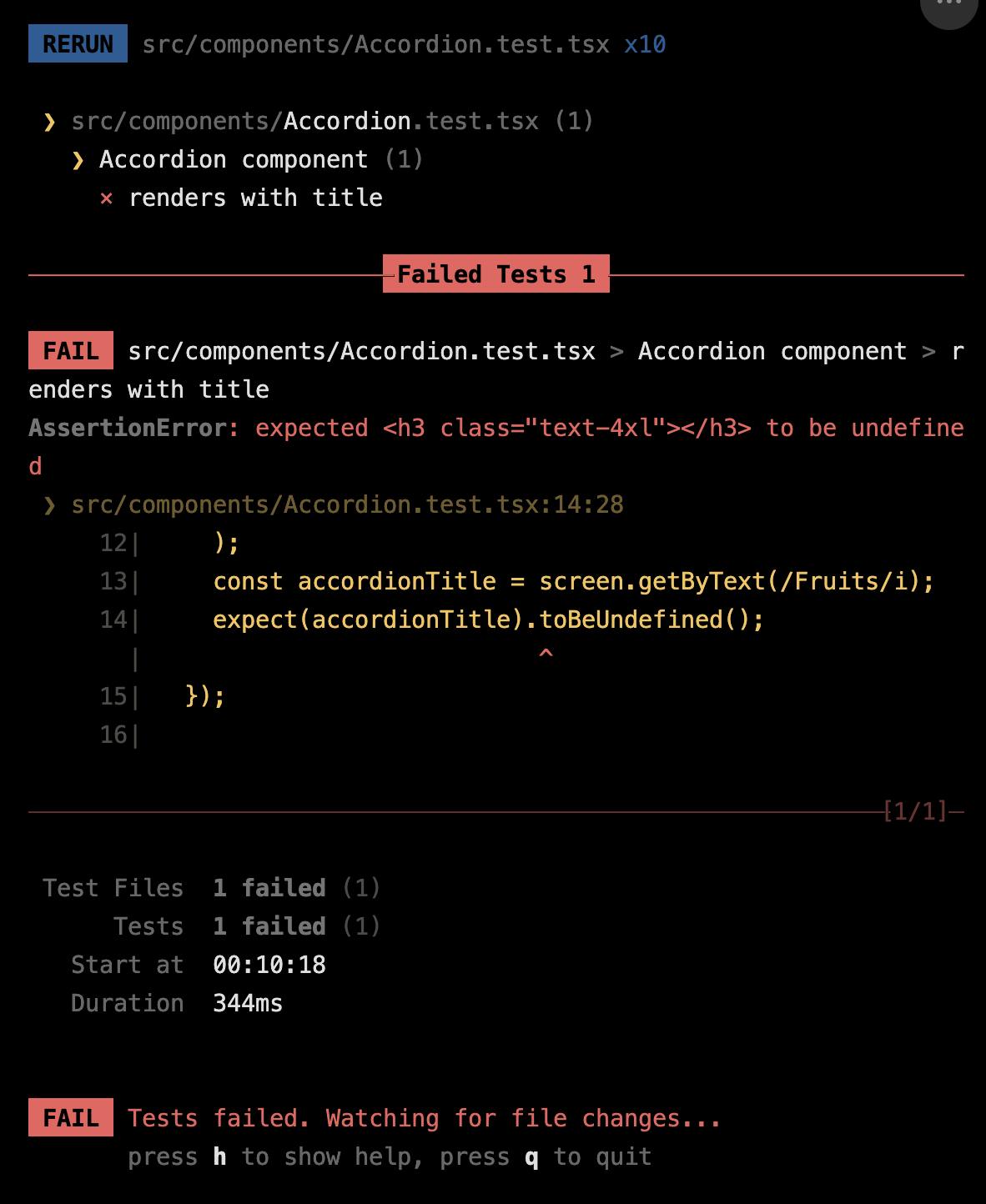
The test is failing here. The expect(accordionTitle) part of the test has evaluated to an h3 element, which is obviously not undefined. To make our test pass again, we can just revert this last change.
Test 2: Accordion should be closed by default
Similar to the previous case, in order to test whether the accordion is closed by default, we must render it first. This time, we will pass a list of items as children.
If we examine our implementation, we can see that when the isOpen value is false, the children would be null after rendering. This implies that if we attempt to query any items from the list, we should not be able to access anything until we open the accordion.
Here's how the code looks when incorporating this logic ⬇️
it("should be closed by default", () => {
    // Given
    const accordionElement = (
      <Accordion title="Fruits">
        <ul>
          <li>Strawberries</li>
          <li>Kiwis</li>
          <li>Peaches</li>
        </ul>
      </Accordion>
    );

    // When
    render(accordionElement);

    // Then
    const listElement = screen.queryByText(/Kiwis/i);
    expect(listElement).toBeNull();
  });
As you might have noticed, in this example we use the method queryByText as opposed to the getByText we used in the first test. The difference between the two is subtle and can be a bit confusing. Both will return the matching node of a query if they are successful, but only queryByText will return null (as opposed to throwing an error) if no elements match. This is very useful in the case of this test where we want to assert an element (like Kiwis) that is not present.
Test 3: The accordion should open on clicking its title, "+" symbol or anywhere in between
Once again, we will start by rendering a different accordion component here first. What is different this time is that we have to trigger a click event on the button element that contains both the title and the "+" symbol.
Luckily, @testing-library/react offers the fireEvent function that lets us simulate DOM events. After we select the button with the getByRole method (remember we have passed the role attribute in our button implementation), we will then pass it into the click method of the fireEvent function. This will trigger a change in the accordion state, which will reveal its contents. If everything works correctly, we should be able to query them successfully and expect them to be present in the DOM.
This is the code that performs this logic ⬇️
  it("should open on clicking anywhere between the title and the + (them included)", () => {
    // Given
    const accordionElement = (
      <Accordion title="Tasks">
        <ul>
          <li>Reading</li>
          <li>Cleaning</li>
        </ul>
      </Accordion>
    );

    // When
    render(accordionElement);

    // Then
    const button = screen.getByRole("button");
    fireEvent.click(button);
    expect(screen.getByText(/Reading/i)).toBeDefined();
  });
Test 4: Should be able to scroll if content exceeds a certain height
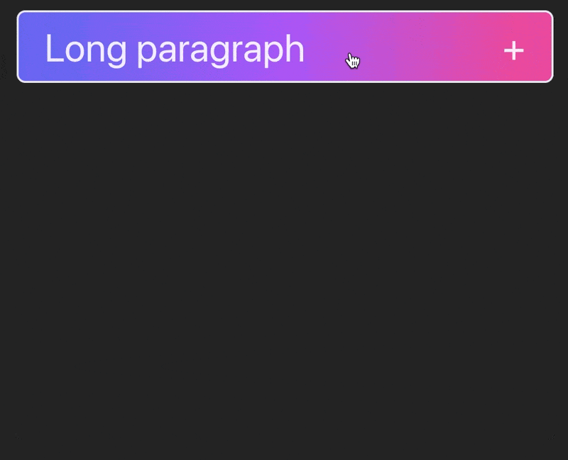
In some cases, the content of the accordion can be extremely long, which can potentially cause layout issues. For that reason, I have added the Tailwind class max-h-[300px], so that the children container cannot exceed 300px. I have also added scroll behaviour, so we can access the content by scrolling, with the classes overflow-y-auto and overscroll-contain.
This is the expected behaviour in case we have a very long paragraph ⬇️
Testing this can be a bit trickier and there might be a few different ways to do that. Here, we are going to make use of the .getComputedStyle method that returns an object containing the values of all CSS properties of an element, after applying active style sheets and resolving any basic computation those values may contain.
Let's first have a look at the code this time ⬇️
  it("should provide scroll option if content is more than 300px high", () => {
    // Given
    const maxHeight = "300px";
    const accordionElement = (
      <Accordion title="Long paragraph">
        <p>
          Lorem ipsum dolor sit amet, consectetur adipiscing elit. Nam porttitor
          convallis odio, a vehicula turpis laoreet non. In hac habitasse platea
          dictumst. Pellentesque ultricies a eros et rhoncus. Nunc varius lacus
          ut felis ultricies blandit. Proin feugiat consectetur est, vitae
          dictum ipsum. Vestibulum blandit, orci id lobortis aliquam, quam lacus
          euismod ex, eget tristique ante diam vel dui. Phasellus in tempor
          erat. Aliquam erat volutpat. In nec tortor velit. Phasellus feugiat
          ante nec nulla tempor, eu aliquam est placerat. Pellentesque quis
          lacus consequat, tristique ex vel, dignissim nunc. Nulla ac est
          consectetur, mattis ante nec, viverra magna. Nulla sit amet mattis
          diam. Sed placerat imperdiet nisl eget ultricies. Nam ut enim id justo
          lacinia rhoncus scelerisque sit amet turpis. Quisque vel euismod elit.
          Donec dapibus elit ipsum, quis rutrum ligula vulputate non.
          Suspendisse a dignissim odio, in molestie tellus. Maecenas purus
          tellus, aliquam at velit vel, efficitur tristique metus. Donec porta
          in lectus non porttitor. Nulla et ultrices velit, quis hendrerit dui.
          Phasellus dui eros, ultrices a nisl quis, facilisis suscipit libero.
          Donec volutpat dapibus leo. Duis eu tempor urna, et sodales nisl.
          Curabitur semper vitae ante a ullamcorper. Etiam a aliquet est, vel
          ornare est.
        </p>
      </Accordion>
    );

    // When
    render(accordionElement);

    // Then
    const titleButton = screen.getByText(/Long paragraph/i);
    fireEvent.click(titleButton);
    const AccordionChildren = screen.getByTestId(/children/i);
    const computedStyle = getComputedStyle(AccordionChildren);
    expect(computedStyle.maxHeight).toBe(maxHeight);
    expect(computedStyle.overflowY).toBe("auto");
  });
In this test, we render an accordion component, the content of which is the long paragraph you can see in the gif above. We fire a click event which reveals its content.
At this point the accordion is open, so we can query its content by using the .getByTestId method (remember, the children have a data-testid attribute). What we expect is the height not to exceed 300px and the scroll bar to appear. We can access the CSS properties of the accordion content by using the .getComputedStyle method. Through the returned object we can evaluate if the properties maxHeight and overflowY have the expected values.
Test 5: Accordion should have proper accessibility attributes
Lastly, let's write a test that checks our component for basic accessibility attributes. The process of rendering the component and selecting the open/close button is the same as in the previous tests.
What we want to check here is if the button has an aria-expanded attribute equal to false by default (since the accordion is closed on the initial state). For this one, we are going to use the .toHaveAttribute method.
Additionally, we want to make sure our button has the aria-controls attribute, that associates it with its content. For this one, we are using the .getAttribute method.
This is how this code looks like ⬇️
  it("has proper accessibility attributes", () => {
    // Given
    const accordionElement = (
      <Accordion title="Tasks">
        <ul>
          <li>Reading</li>
          <li>Cleaning</li>
        </ul>
      </Accordion>
    );

    // When
    render(accordionElement);

    // Then
    // Find the accordion toggle button
    const button = screen.getByRole("button");
    // Check that the button has the correct aria-expanded attribute
    expect(button).toHaveAttribute("aria-expanded", "false");
    // Check that the button has the correct aria-controls attribute
    const contentId = button.getAttribute("aria-controls");
    expect(contentId).toBeTruthy();
  });
Running all the tests
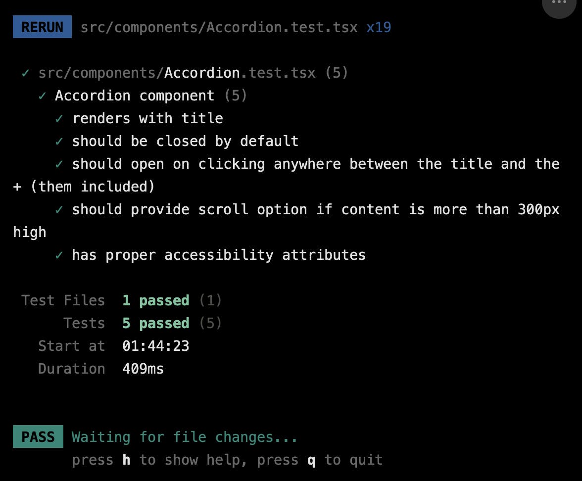
After running all of our tests one final time, we observe that everything passes successfully, ensuring smooth functionality for our accordion 🙂✨
Wrapping up
Well done! You have officially reached the end of this tutorial :) Hopefully, this has helped you gain a better understanding of testing in the context of React components. Please feel free to explore more tests that can ensure the quality and robustness of your apps. As always, you are welcome to leave comments with suggestions, questions, corrections, and any other feedback you find useful.
Thank you for reading!