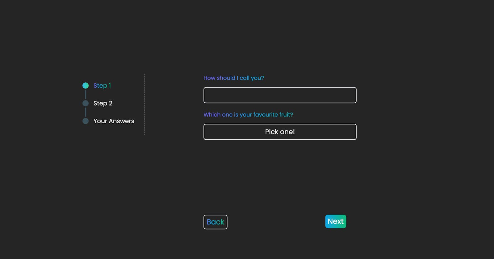
Building a multi-step form with Next.js - Part 1
Architecture, basic functionality and state management with Zustand
Introduction
Forms are one of the most commonly used interactive elements in modern web development. Whether it traditionally looks like a form (e.g. when submitting your billing information), like a tweet post, or like a search bar, forms are everywhere!
It's often very useful to collect data from users in stages, grouping related information together. Imagine you are building a recipe app, and you want to offer users suggestions based on their preferences, potential allergies, calorie limits, etc. By categorizing your questions into different segments (steps), you can help users provide answers in a structured and easy way.
What we will focus on in Part 1
For ease, I am going to split this guide into three different blog posts:
In the first one, we are taking a look mainly at the frontend of our application, interactivity and state management. That means that all inserted data will be lost as soon as we refresh our page since we have no storage setup (yet).
In the second part, we are going to explore ways to validate and store the form data in local storage, as well as a database, by introducing some backend functionalities.
Lastly, in the third part, we are going to make this form more dynamic, by connecting a CMS to our application. This will allow us to control the steps as well as the questions without having to alter the code, but by accessing our CMS.
In this guide, I am keeping the nature of the questions short and playful on purpose, as I want to focus on the techniques used instead of the content. Feel free to use your imagination and expand these to your liking!
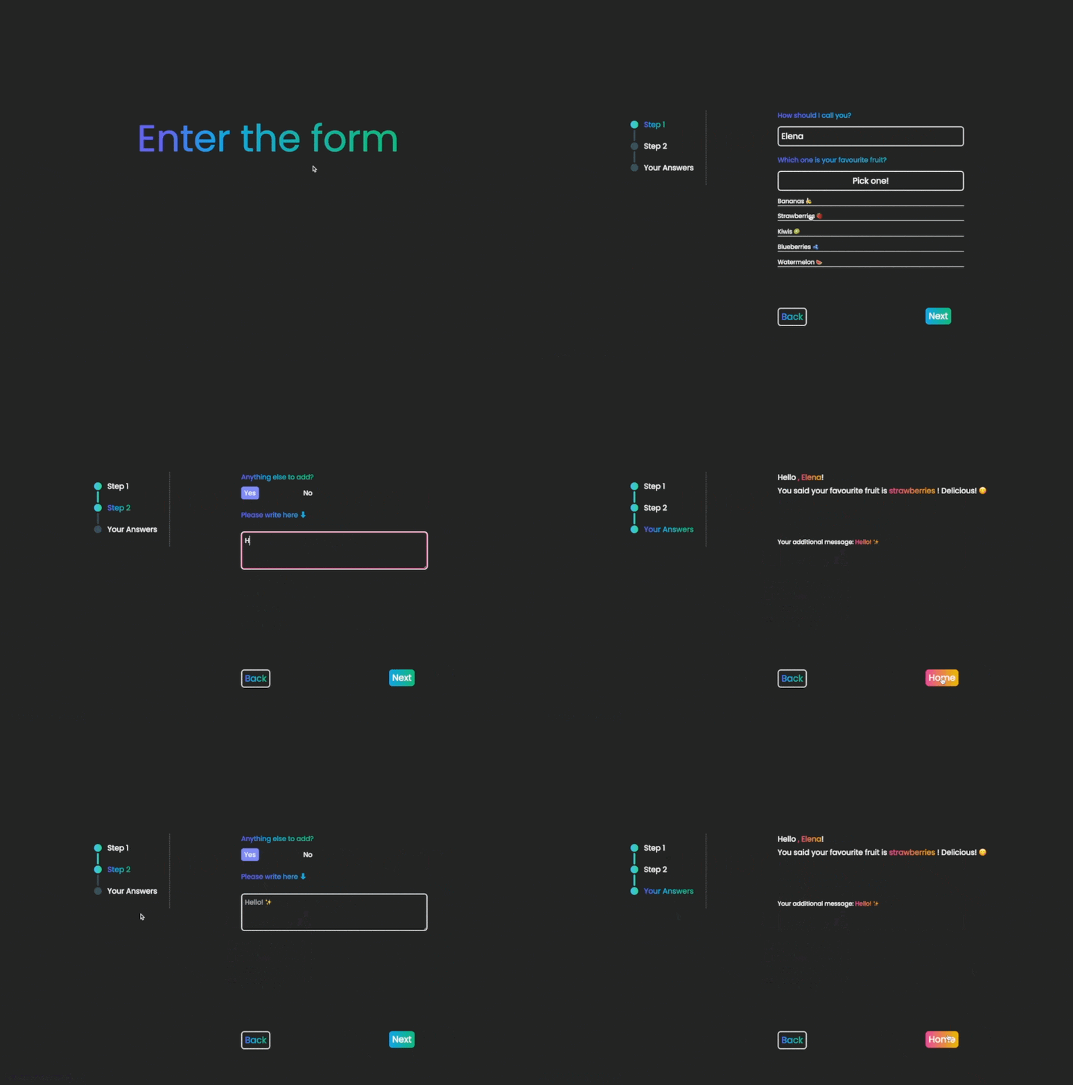
This is what we want to achieve by the end of Part 1 of this guide ⬇️
Repository
Feel free to access the code of this example here:
GitHub: https://github.com/elenamarinaki/multi-step-form---part1
CodeSandbox: https://codesandbox.io/p/github/elenamarinaki/multi-step-form---part1/main
⚠️ Please note that I am not going to be providing CSS explanation in this tutorial. You may use the repo as a reference for the styles I used (with Tailwind in this case).
Architecture
I always find it useful (aside from it being good practice) to separate the components that have a visual role (e.g. layouts) from the ones that are responsible for the functionality (e.g. routing, functions that provide logic).
Since we are using Next, this is quite simple to achieve: the components that are responsible for each separate step (route) are going under the pages folder, whereas the ones that are rendering the inputs, navigation buttons and progress steps are going under the components folder.
At this stage, we have a predefined number of two steps and a final one that renders the answers of the user. Including the homepage, we have four routes in total:
Homepage -
/Step 1 -
/step-oneStep 2 -
/step-twoYour Answers -
/your-answers
Each one of these routes uses a different combination of visual components under the components folder to structure the information that they need to render.
Let's have a look at /step-one of the app ⬇️
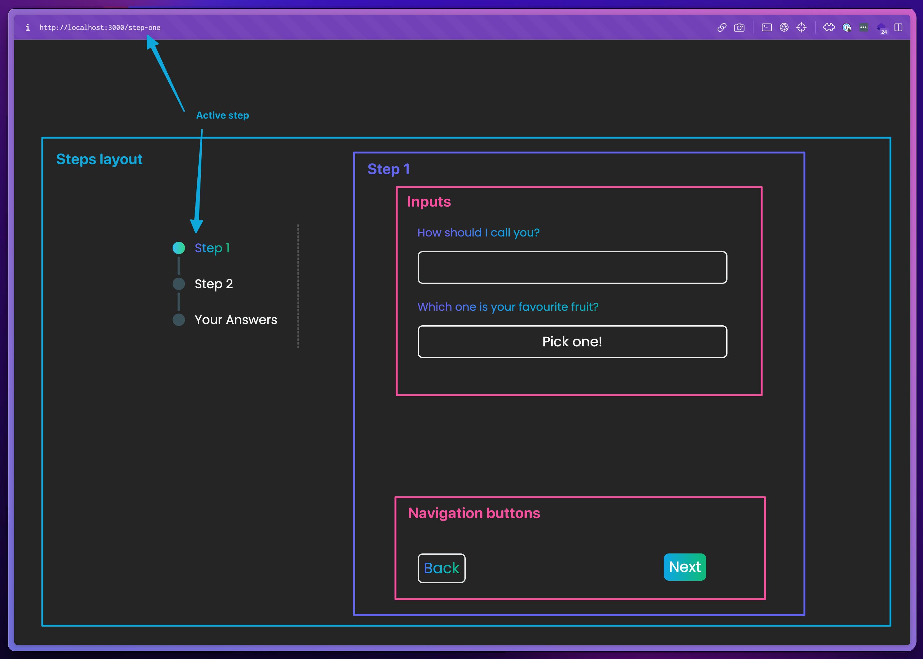
Visual components of the form - notice how the elements are nested 🪆
We notice that there is a nesting pattern in the visual structure here. Each step (Step 1 here) is being wrapped into a Steps layout that is always rendering the progress steps on the left for all form steps. This choice here serves two purposes: the component Steps layout should not be used without content and vice versa, so these two elements (a.k.a. the steps layout and the step content) are intertwined in context. At the same time, this layout provides a consistent styling solution, as we need to provide the code for that only once and then have it being applied just by reusing it.
Each step (Step 1 here) is the children prop that is being passed into the Steps layout and is responsible for hosting various inputs (e.g. text, dropdown menu, radio etc.) as well as the navigation buttons that move the form forward and backwards.
In the next section, we are going to start building these blocks. We generally move from the outer to the more inner sections, without that meaning we don't slightly break this pattern when necessary.
Let's dive in! 🤿
Building our pages & components
Install Next.js
To create a new Next project, run:
npx create-next-app@latest
During installation, you will be presented with the following choices:
1. What is your project named? [your_name]

2. Would you like to add TypeScript with this project? Y/N

3. Would you like to use ESLint with this project? Y/N

4. Would you like to use Tailwind CSS with this project? Y/N

5. Would you like to use the src/ directory with this project? Y/N

6. What import alias would you like configured? @/*
After picking a name for this example, I answered Y (Yes) to all other choices. Feel free to do the same :)
To run the application on your localhost, run:
npm run dev
You are now ready to start developing! 🚀
Routing
As mentioned above, we currently have a predefined number of steps. Let's go into the pages folder and create one new route for each one (index.tsx should already be there upon installation):
step-one.tsxstep-two.tsxyour-answers.tsx
This is how the pages folder should look like ⬇️
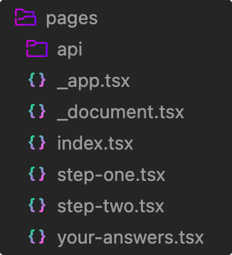
For each one of the routes (index, step-one, step-two, your-answers), just add a simple component that returns some text for the time being. We want to be able to access them on our localhost, so each one of these files should have a function.
For example, in step-one.tsx add this ⬇️
const StepOne = () => {
  return (
    <>
      <h2>Step 1</h2>
    </>
  )
}

export default StepOne
You may do the same for the other three routes, adjusting the names accordingly.
Layouts
In the Architecture section above, we had a high overview of the organisation of the visual components. Let's see it again in a simple diagram (the colours are matched with the image of the Architecture section) ⬇️
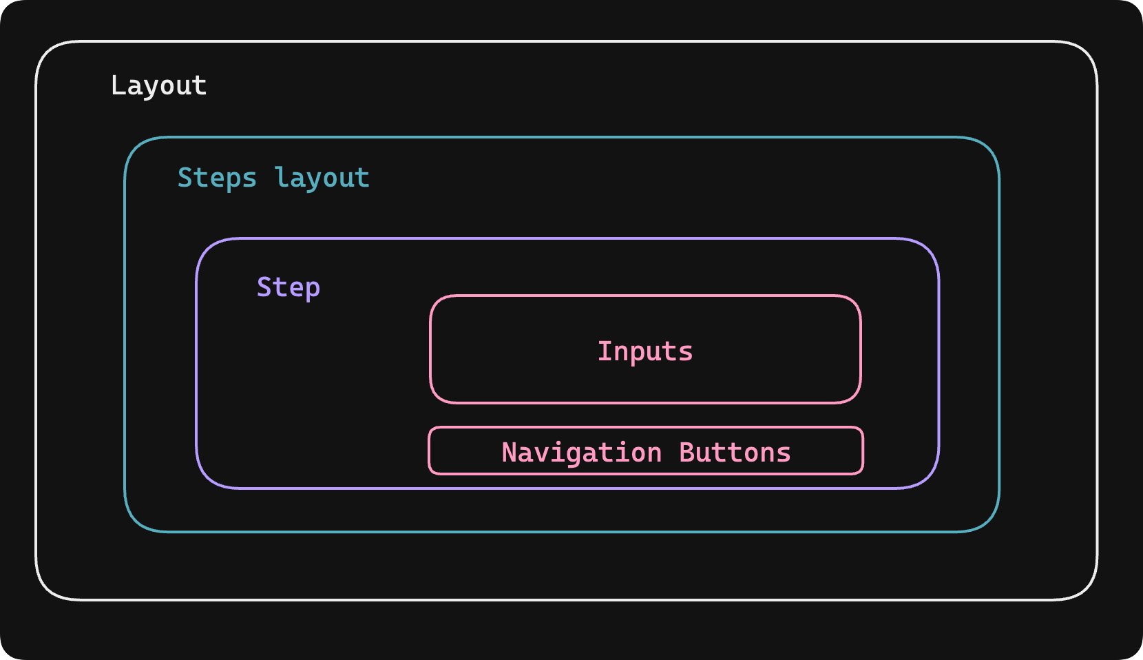
A diagram that shows the hierarchy of visual components
General Layout
The outer container (white) provides some basic styling and structure for all pages regardless of their functionality.
Create a components folder under src. Inside, create a file named Layout.tsx. This component will have just a section element that takes some children elements as a prop. This is the code ⬇️
import { ReactNode } from "react"

type LayoutProps = {
  children: ReactNode
}

export const Layout = ({ children }: LayoutProps) => {
  return (
    <section className='py-16 px-4 flex justify-center items-center mt-[24vh]'>
      {children}
    </section>
  )
}
Since we are using Typescript, we create the type for the children prop before we pass it into the component.
Every time we create a new page we are going to wrap it into this component so the very basic styling of all pages is consistent site-wide. Let's do the same for all components under pages and wrap each one into Layout.
For example, this is what step-one.tsx should look like now ⬇️
import { Layout } from "@/components/Layout"

const StepOne = () => {
  return (
    // wrapping the component into Layout
    <Layout>
      <h2>Step 1</h2>
    </Layout>
  )
}

export default StepOne
Feel free to do the same for /, step-two and your-answers routes :)
Steps Layout
The Steps Layout (cyan colour in the diagram) is the layout going to be used for all pages that are part of the form. Its structure is simple, as it is essentially made of the three links (progression steps) that direct to each step of the form and a children component as an argument. This is eventually the reserved slot for the code that renders the content of each step that will come later.
Under the components folder, create a StepsLayout.tsx file.
In its simplest form (Tailwind code aside!), this is what the code of this component looks like ⬇️
import { ReactNode } from "react"
import Link from "next/link"

type StepsLayoutProps = {
  children: ReactNode
}

export const StepsLayout = ({ children }: StepsLayoutProps) => {
  return (
    <article className='flex justify-start gap-28 min-w-[82%]'>
      <div className='flex flex-col px-8 py-6 mx-20 h-[200px] border-r-2 border-[#8586887c] border-dashed'>
        <Link href='/step-one'>
          <p>Step 1</p>
        </Link>
        <Link href='/step-two'>
          <p>Step 2</p>
        </Link>
        <Link href='/your-answers'>Your Answers</Link>
      </div>
      <form>{children}</form>
    </article>
  )
}
Each step is wrapped in a Link element that directs to it. The children are coming in as a prop: this is where the different kinds of inputs will come in later along with the navigation buttons.
Behaviour of the progression steps & active state
Let's see again how the progression steps behave in various stages:
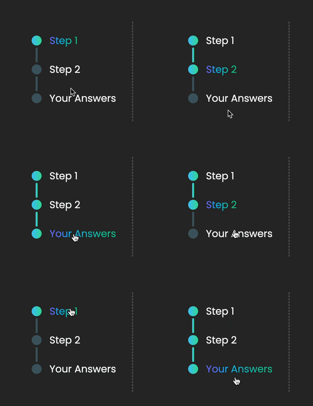
Depending on which step we are currently in, we have two things occuring: the title of the step gets highlighted with a different colour, as well as its accompanying dot along with all other dots preceding it. This behaviour allows us to know which stage we are currently in (highlighted text) as well as "how much" of the form is complete (dots trailing).
Let's first take a look at the code for the dots and vertical lines. Since these two are icons, we can put them in a separate folder. Make a folder named icons under the components folder. Inside, create two files: Dot.tsx and VerticalLine.tsx.
In the Dot.tsx, add this ⬇️
type DotProps = {
  active: boolean
}

export const Dot = ({ active }: DotProps) => {
  return (
    <div
      className={`w-[20px] h-[20px] rounded-full ${
        active ? "bg-gradient-to-r from-sky-400 via-30% to-emerald-400 to-90%" : "bg-sky-300 opacity-25 hover:opacity-40"
      }`}
    ></div>
  )
}
And in the VerticalLine.tsx, add this ⬇️
type VerticalLineProps = {
  active: boolean
}

export const VerticalLine = ({ active }: VerticalLineProps) => {
  return (
    <div
      className={`w-[4px] h-[30px] ml-2 rounded ${
        active
          ? "bg-gradient-to-r from-sky-400 via-30% to-emerald-400 to-90%"
          : "bg-sky-300 opacity-25"
      } `}
    ></div>
  )
}
In the given code snippet, two components utilize a prop named active, which is a boolean. Depending on its value, the CSS applied to the elements varies. When the active prop is true, the element displays a vibrant colour, while a more muted colour is used when it is false.
Let's go back and use them in the StepsLayout.tsx file. Inserting them into place, the code should look like this ⬇️
import { ReactNode } from "react"
import Link from "next/link"
//importing the new icons
import { Dot } from "./icons/Dot"
import { VerticalLine } from "./icons/VerticalLine"

type StepsLayoutProps = {
  children: ReactNode
}

export const StepsLayout = ({ children }: StepsLayoutProps) => {
  return (
    <article className='flex justify-start gap-28 min-w-[82%]'>
      <div className='flex flex-col px-8 py-6 mx-20 h-[200px] border-r-2 border-[#8586887c] border-dashed'>
        <Link href='/step-one'>
          <div className='flex items-center gap-4'>
            <!--dot is highlighted (active) here-->
            <Dot active />
            <p>Step 1</p>
          </div>
        </Link>
        <!--vertical line is not active-->
        <VerticalLine active={false} />
        <Link href='/step-two'>
          <div className='flex items-center gap-4'>
            <!--the second dot is not active-->
            <Dot active={false} />
            <p>Step 2</p>
          </div>
        </Link>
        <!--the second vertical line is not active too-->
        <VerticalLine active={false} />
        <Link href='/your-answers'>
          <div className='flex items-center gap-4'>
            <!--the third dot is not active-->
            <Dot active={false} />
            <p>Your Answers</p>
          </div>
        </Link>
      </div>
      <form>{children}</form>
    </article>
  )
}
At this stage, the component should look like this:
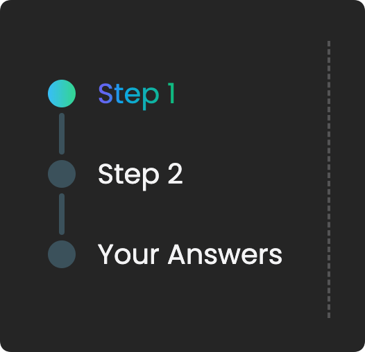
Accessing the current pathname
That is great, but you will notice there is not much happening when visiting other steps. This is because we are not dynamically updating the active prop that we passed into the components, so let's see how we can fix that!
We need to make these elements aware of the current route. To do that, we are going to use the useRouter hook provided by the next/router package. Through this, we can access the current path by accessing the property pathname of the router object:
import { ReactNode } from "react"
import Link from "next/link"
//importing the hook
import { useRouter } from "next/router"
import { Dot } from "./icons/Dot"
import { VerticalLine } from "./icons/VerticalLine"

type StepsLayoutProps = {
  children: ReactNode
}

export const StepsLayout = ({ children }: StepsLayoutProps) => {
  // using the hook
  const router = useRouter()
  // console.log(router.pathname) -> '/step-one'

  return (
    <article className='flex justify-start gap-28 min-w-[82%]'>
        <!--code as before-->
    </article>
  )
}
Now that we have access to this information, we can check for each step if its designated path happens to be the current pathname. If that is true, then we make the active props of the Dot component true, otherwise we set it to false.
import { ReactNode } from "react"
import Link from "next/link"
import { useRouter } from "next/router"
import { Dot } from "./icons/Dot"
import { VerticalLine } from "./icons/VerticalLine"

type StepsLayoutProps = {
  children: ReactNode
}

export const StepsLayout = ({ children }: StepsLayoutProps) => {
  const router = useRouter()

  // assigning Boolean values to variables
  // if `activeOne` is true for example, it means we're on step 1
  const activeOne = router.pathname === "/step-one"
  const activeTwo = router.pathname === "/step-two"
  const activeAnswers = router.pathname === "/your-answers"

  return (
    <article className='flex justify-start gap-28 min-w-[82%]'>
      <div className='flex flex-col px-8 py-6 mx-20 h-[200px] border-r-2 border-[#8586887c] border-dashed'>
        <Link href='/step-one'>
          <div className='flex items-center gap-4'>
            <!--updating the active prop-->
            <Dot active={activeOne} />
            <p>Step 1</p>
          </div>
        </Link>
        <!--updating the active prop-->
        <VerticalLine active={activeOne} />
        <Link href='/step-two'>
          <div className='flex items-center gap-4'>
            <!--updating the active prop-->
            <Dot active={activeTwo} />
            <p>Step 2</p>
          </div>
        </Link>
        <!--updating the active prop-->
        <VerticalLine active={activeTwo} />
        <Link href='/your-answers'>
          <div className='flex items-center gap-4'>
            <!--updating the active prop-->
            <Dot active={activeAnswers} />
            <p>Your Answers</p>
          </div>
        </Link>
      </div>
      <form>{children}</form>
    </article>
  )
}
⚠️ But there is a small catch here! While this works fine for highlighting the title of an active step, it does not keep the information of the icons of the previous steps.
This is how it currently behaves ⬇️
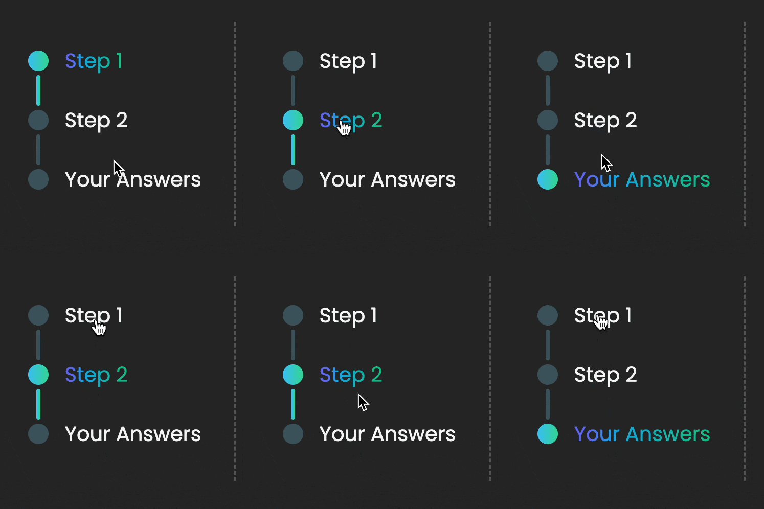
Well, we don't want that! ❌
We want the previous progression steps to remain highlighted as we are moving to the next ones. Let's think about how this translates logically 🤔
The dot of the first step is always going to be highlighted and the dot of the last step (Your Answers) is going to be highlighted only when /your-answers is the active pathname.
Things are different for the second step dot, since it should not be highlighted on the first step, but it should stay highlighted on the second step and the answers step. Similarly for the vertical line that connects the first and second step. Lastly, the vertical line that connects the second with the final step should only be highlighted on the /your-answers route as well.
Translating this into code, this is how the StepsLayout.tsx should look like ⬇️
(Please note how we are turning the step title into a separate component StepTitle to avoid having to re-write the styles multiple times)
import { ReactNode } from "react"
import Link from "next/link"
import { useRouter } from "next/router"
import { Dot } from "./icons/Dot"
import { VerticalLine } from "./icons/VerticalLine"

type StepTitleProps = {
  active: boolean
  title: string
}

type StepsLayoutProps = {
  children: ReactNode
}

// the component that renders the title of each step
// it takes `active` and `title` as props
export const StepTitle = ({ active, title }: StepTitleProps) => {
  return (
    <h2
      className={`text-xl ${
        active
          ? "text-transparent bg-clip-text bg-gradient-to-r from-indigo-500 from-10% via-sky-500 via-30% to-emerald-500 to-90%"
          : "text-zinc-100"
      }`}
    >
      {title}
    </h2>
  )
}

export const StepsLayout = ({ children }: StepsLayoutProps) => {
  const router = useRouter()

  const activeOne = router.pathname === "/step-one"
  const activeTwo = router.pathname === "/step-two"
  const activeAnswers = router.pathname === "/your-answers"

  return (
    <article className='flex justify-start gap-28 min-w-[82%]'>
      <div className='flex flex-col px-8 py-6 mx-20 h-[200px] border-r-2 border-[#8586887c] border-dashed'>
        <Link href='/step-one'>
          <div className='flex items-center gap-4'>
            <!--first dot is always active-->
            <Dot active />
            <!--each step title is only active on the same-named route-->
            <StepTitle active={activeOne} title='Step 1' />
          </div>
        </Link>
        <!--the first vertical line is active on the second and final step-->
        <VerticalLine active={activeTwo || activeAnswers} />
        <Link href='/step-two'>
          <div className='flex items-center gap-4'>
            <!--the second dot is active on the second and final step-->
            <Dot active={activeTwo || activeAnswers} />
            <!--each step title is only active on the same-named route-->
            <StepTitle active={activeTwo} title='Step 2' />
          </div>
        </Link>
        <!--the second vertical line is only active on the last step-->
        <VerticalLine active={activeAnswers} />
        <Link href='/your-answers'>
          <div className='flex items-center gap-4'>
            <!--the last dot is only active on the last step-->
            <Dot active={activeAnswers} />
            <!--each step title is only active on the same-named route-->
            <StepTitle active={activeAnswers} title='Your Answers' />
          </div>
        </Link>
      </div>
      <form>{children}</form>
    </article>
  )
}
With these adjustments, the progression steps work correctly!
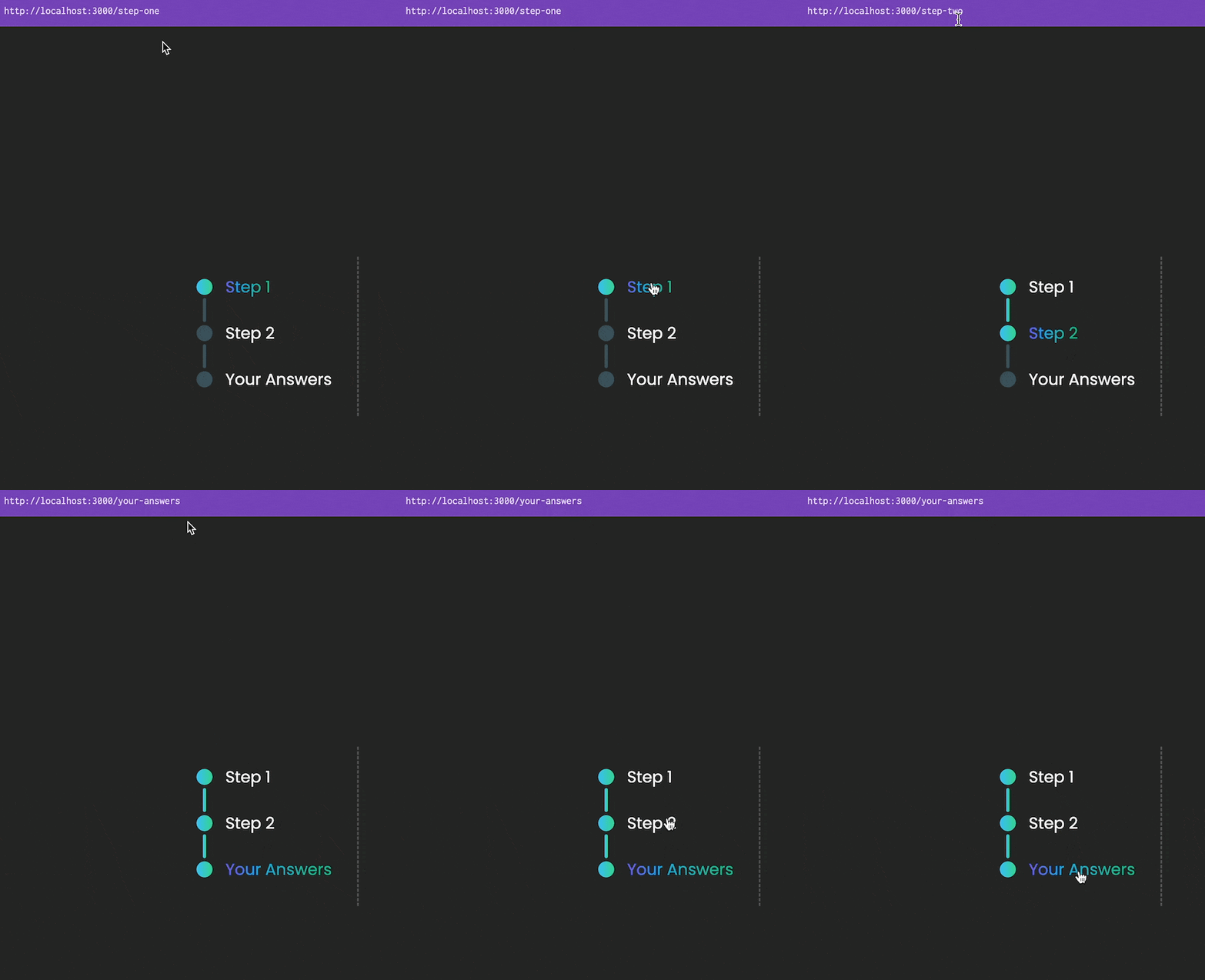
Progression steps updated depending on active step and stage - notice how the path changes
Creating the Step component
As we have already seen, each step has some fields for user input, as well as navigation buttons to move to the previous and next steps.
Let's see it again quickly ⬇️

Every step component has a combination of different kinds of inputs (radio, dropdown, text, etc) as well as navigation buttons.
For the buttons, create a file NavigationButtons.tsx under the components folder. That's the code for their functionality ⬇️
import Link from "next/link"

type NavigationButtonsProps = {
  back: string
  next: string
  home?: boolean
}

export const NavigationButtons = ({
  back,
  next,
  home,
}: NavigationButtonsProps) => {
  return (
    <div className='absolute bottom-[100px] flex gap-80'>
      <Link href={back}>
        <p className='px-2 py-1 border-2 rounded-lg text-[24px] text-transparent bg-clip-text bg-gradient-to-r from-indigo-500 from-10% via-sky-500 via-30% to-emerald-500 to-90% hover:from-pink-500 hover:to-yellow-500'>
          Back
        </p>
      </Link>
      <Link href={next}>
        <p className='px-2 py-1 rounded-lg text-[24px] text-slate-50 bg-gradient-to-r from-sky-500 via-30% to-emerald-500 to-90% hover:from-pink-500 hover:to-yellow-500'>
          {home ? "Home" : "Next"}
        </p>
      </Link>
    </div>
  )
}
To make the component more reusable, we pass props for back, next and home pages. This allows us to adjust the previous and next paths depending on the current step.
Now we can shape the code for the step itself. Create a file Step.tsx under the components folder with this code ⬇️
import { ReactNode } from "react"
import { NavigationButtons } from "./NavigationButtons"

type StepProps = {
  children: ReactNode
  back: string
  next: string
  home?: boolean
}

export const Step = ({ children, back, next, home }: StepProps) => {
  return (
    <div className='flex flex-col justify-between min-w-[500px] min-h-[200px]'>
      <!--this is where various type of inputs will be passed in-->
      {children}
      <NavigationButtons back={back} next={next} home={home} />
    </div>
  )
}
Notice how there is a reserved slot for the various inputs here. We can pass them in as children of the component.
⚠️ Note about input components
I am not going to go into detail about each separate type of input, as I am going to elaborate more in the section about managing state. Please feel free to have a look at the inputs folder under components in the repository I provided at the beginning of this guide.
As a sample, here is what a simple text input field looks like ⬇️
import { useState } from "react"

type TextInputProps = {
  labelText?: string
}

export const TextInput = ({ labelText }: TextInputProps) => {
  const [inputText, setInputText] = useState("")

  return (
    <>
      <label
        htmlFor='text'
        className='text-[18px] text-transparent bg-clip-text bg-gradient-to-r from-indigo-500 from-10% via-sky-500 via-30% to-emerald-500 to-90%'
      >
        {labelText}
      </label>
      <input
        type='text'
        name='text'
        placeholder={inputText}
        onChange={(e) => setInputText(e.target.value)}
        className='bg-transparent border-2 rounded-lg p-2 text-[22px]'
      />
    </>
  )
}
Putting everything together
Now that all our layouts and navigation functionality are ready, let's go back and update the step-one.tsx file under the pages folder ⬇️
import { Layout } from "@/components/Layout"
import { StepsLayout } from "@/components/StepsLayout"
import { Step } from "@/components/Step"
import { TextInput } from "@/components/inputs/TextInput"
import { DropdownInput } from "@/components/inputs/DropdownInput"

const StepOne = () => {
  return (
    // generic layout for all pages
    <Layout>
      <!--specific layout only for steps with progression bar-->
      <StepsLayout>
        <!--step 1-->
        <!--navigating to the home page and step 2 respectively-->
        <Step back='/' next='/step-two'>
          <div className='flex flex-col gap-4'>
            <!--simple text input-->
            <TextInput labelText='How should I call you?' />
          </div>
        </Step>
      </StepsLayout>
    </Layout>
  )
}

export default StepOne
This is how step 1 looks now 🎉
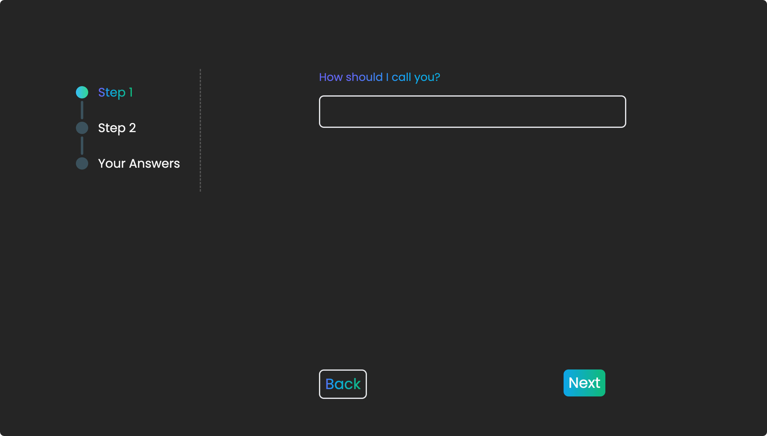
Step 1 after putting all components together
Please feel free to add your own inputs and customise each step to your liking!
State management
There are quite a few ways to manage the state of an application and it can often be quite an opinionated matter. I am just going to provide an option here that has worked quite well for me in the past, without that meaning that this is the "correct" or only way.
In this application, we need to store the user inputs as they add their data to the form so we can easily access them at the last step. A simple approach is by using the useState hook provided by React in each input component. This is perfectly fine, but it gets a bit trickier when we want to conditionally render some questions based on previous responses, which requires some inter-step communication. There are different approaches to solving this problem, but what I personally prefer is to be able to manage the state of my application in a more centralised way.
We could move all state data on the highest common component, in this case, the StepsLayout component. This would mean that we would have to pass the state to each nested component as props, resulting in unnecessary prop drilling and more complex code.
To avoid this, we are going to use a lightweight and easy-to-use state management library, called Zustand!
Zustand
According to its documentation...

"What is Zustand?" - as described in its documentation
But why?
Zustand simplifies state management by using a store, which is a single object that holds the entire state of our application. We can create, update, and access the state using hooks or API methods provided by the library. The library allows us to define our state, actions, and any related logic in one place, making it easy to manage and reason about our application's state.
Setup
Let's install the package ⬇️
npm install zustand
Well, that's it! Let's go ahead and start using the library 🛸
The store
The store is a central concept in Zustand. This is the place where all the state of our application resides. Let's see how it works by adding it to our form!
Under src, add a folder named store. Inside, create a file called form.ts. We will add here all state information related to the form. Maybe this is a bit redundant here, but in a bigger application where you have to manage many different functionalities, it is good to separate your state information accordingly.
In the form.ts, we import the create function from the zustand package and use it to create a form store. This will look like this ⬇️
import { create } from "zustand"

const useFormStore = create((set) => ({}))

export default useFormStore
🎗️Remember to use the prefix use for your stores names (useFormStore), as per hooks' convention :)
Let's say we want to store the text of a simple <input /> element. In traditional useState fashion, we would write something like:
const [inputText, setInputText] = useState('')
Here, we add these two into the callback function that we pass into create.
Let's first see how this will look like ⬇️
import { create } from "zustand"

const useFormStore = create((set) => ({
  // initial text value
  inputText: "",
  // function that updates the text value upon change
  setInputText: (value) => set({ inputText: value }),
}))

export default useFormStore
Here, we initialise the value of inputText to an empty string, while the setInputText becomes the function responsible for updating the inputText value when that changes.
Let's add some types since we are using typescript here :)
import { create } from "zustand"

// types for the input string + the `set` function
type FormStore = {
  inputText: string
  setInputText: (value: string) => void
}

const useFormStore = create<FormStore>()((set) => ({
  inputText: "",
  setInputText: (value) => set({ inputText: value }),
}))

export default useFormStore
Ok, now we are ready to use these two in our TextInput component. We have the component already working with the useState hook above, so we can just replace it with the useFormStore.
This is how it will look after we bring zustand in ⬇️
// we import the `useFormStore` from our store
import useFormStore from "@/store/form"

type TextInputProps = {
  labelText?: string
}

export const TextInput = ({ labelText }: TextInputProps) => {
  // we access the two properties through destructuring
  // ⚠️ notice the use of curly brackets (instead of [])
  const { inputText, setInputText } = useFormStore()

  return (
    <>
      <label
        htmlFor='text'
        className='text-[18px] text-transparent bg-clip-text bg-gradient-to-r from-indigo-500 from-10% via-sky-500 via-30% to-emerald-500 to-90%'
      >
        {labelText}
      </label>
      <input
        type='text'
        name='text'
        placeholder={inputText}
        onChange={(e) => setInputText(e.target.value)}
        className='bg-transparent border-2 rounded-lg p-2 text-[22px]'
      />
    </>
  )
}
You can similarly treat all other types of inputs. A full version of this can be found in the repo I provide at the beginning of this guide 🪴
Render the inputs in the final step
In multi-step forms, it is very useful to provide a summary of all the data the user has added. This allows them to make any changes they wish before submitting the form.
Following this practice, in the last stage of the form (/your-answers) we render the answers given by the user.
This is how it looks like in our example ⬇️
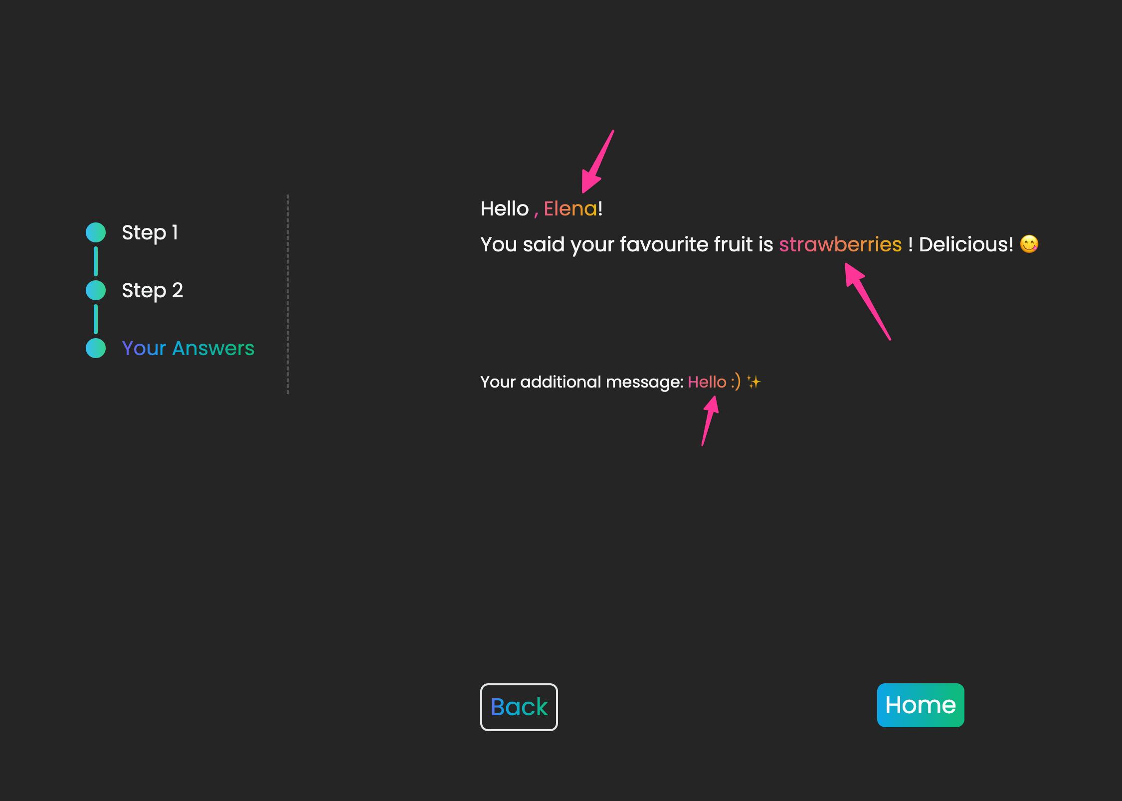
Last step - the user's answers. All inputted data is highlighted
Since we are using zustand, we can easily access this data from the form store and render it here! Similarly to other components, we just import the useFormStore hook we created and access the values we need.
Going back to the file your-answers.tsx under the pages folder, we can add this code that renders the data as it appears in the screenshot above:
import { Layout } from "@/components/Layout"
import { StepsLayout } from "@/components/StepsLayout"
import { NavigationButtons } from "@/components/NavigationButtons"
// import the form store
import useFormStore from "@/store/form"

type GivenValueProps = {
  givenValue: string
}

const GivenValue = ({ givenValue }: GivenValueProps) => {
  return (
    <span className='text-transparent bg-clip-text bg-gradient-to-r from-pink-500 to-yellow-500'>
      {givenValue}
    </span>
  )
}
const YourAnswers = () => {
// accessing all data given by the user from the form store through destructuring
const { inputText, selectedDropdownElement, radioOption, inputTextArea } =
    useFormStore()

  return (
    <Layout>
      <StepsLayout>
        <div className='flex flex-col justify-between min-w-[500px] min-h-[200px]'>
          <div className='flex flex-col gap-2'>
            <!--rendering the given values-->
            <p className='text-xl'>
              Hello{" "}
              {inputText.length !== 0 ? (
                <GivenValue givenValue={`, ${inputText}`} />
              ) : (
                "there"
              )}
              !
            </p>
            {selectedDropdownElement.id !== 0 ? (
              <p className='text-xl'>
                You said your favourite fruit is{" "}
                <GivenValue
                  givenValue={selectedDropdownElement.name
                    .slice(0, -2)
                    .toLowerCase()}
                />
                ! Delicious! 😋
              </p>
            ) : (
              <>
                <p>You haven't picked anything yet! 😱</p>
                <p>Make sure you go back and pick something tasty 😉</p>
              </>
            )}
          </div>
          {radioOption === "yes" ? (
            <p>
              Your additional message: <GivenValue givenValue={inputTextArea} />
            </p>
          ) : (
            <p>You had no additional message!</p>
          )}
          <NavigationButtons back='/step-two' next='/' home />
        </div>
      </StepsLayout>
    </Layout>
  )
}

export default YourAnswers
So, what's next?
First of all, well done! This is a long guide and you have just reached the end of the first part! 👏
At this point though, our form is not yet complete. As you might have already noticed, we do not validate our fields and we do not submit any data anywhere. Right now, as soon as we refresh the page, all state gets lost!
This is what we will focus on in the next part of this series. We will explore ways we can validate and store the data given by the user in their device's local storage or in a remote database. In the meantime, feel free to explore more of the concepts discussed here and make your own versions of the form.
Thank you for reading and hope to see you soon in the next part! ⚡️
